Tuesday 17 December 2013

Wikipedia - Socially constructed knowledge


Social networking turns up in all sorts of places.  For the Coursera course on Social network analysis I had to investigate a social network.  I chose Wikipedia because an article page includes links to other article pages.  Those links are a social construct; in theory anybody can edit any page so the links reflect a social view of the structure of the knowledge in the encyclopedia.

I used a Python program to do a breadth-first search of pages (based on one from the book Mining the Social Web), following links from a named page.  The resulting graph was displayed using Gephi

Social Network Analysis

Fig. 1 shows the graph obtained by following linked pages to a depth of 2 starting from the Social Network Analysis page.  Each node represents a Wikipedia page.  There is a root to this graph, the node
corresponding to the title 'Social Network Analysis'. This has been coloured in red. It has 49 edges. There is clustering around some topics and some nodes that link these clusters.

Fig 1 Graph of linked pages in Wikipedia starting from Social Network Analysis (in Red)

Most nodes had a degree of 1, but some had much higher degrees. The nodes with a higher degree than Social Network Analysis and the links between them have been selected in Fig. 2. There are 9 heavily linked nodes which are linked to each other. There is a common and surprising thread linking 5 of these: Computer Surveillance, Mass Surveillance, Terrorism, Espionage and National Security Agency (NSA). All 5 are concerned with aspects of security. It seems that when people contribute to Wikipedia about SNA they are linking to  pages about security. The page on the NSA is particularly notable, with the highest degree here of 251.
Fig 2 Wikipedia pages linked to Social Network Analysis page with largest number of links

 Art Deco Ceramics

Just to show how useful these techniques can be, I applied them to a very different topic.  I have an interest in a type of 1930's pottery produced in England at the Shelley Potteries.  So I ran the same process starting at the Shelley Potteries Wikipedia page and got Fig. 3.  This shows so clearly how Shelley pottery was influenced by two main movements: Art Nouveau and Art Deco.  

Fig. 3 Links from Shelley Potteries Wikipedia page

Conclusion

With relatively simple techniques it's possible to mine the structures built in to the Wikipedia links to reveal graphically the relationships between topics.


Wednesday 5 June 2013

MOOCs from the Student Viewpoint

How to see what the lecturer is pointing to

I'm now taking MOOCs.  So as I do so I'll be making a few random comments on my experience.  This is the first.
 
Every online lecturer  talks about what's on their slides; most point as they do so.  How they do this makes a difference.  There can be a simple cursor, showing the location of what is being pointed to.  This is often difficult to see, especially if it's the same colour as the text.  Better is the ability to write on the slide in a contrasting colour, although this does seem to require skill from the lecturer in manipulating the pointing device.

There may be another way, that doesn't use slides.  See the lecture by Donald Knuth (still an innovator) at http://www.youtube.com/watch?v=axUgEAgrSB8.  Here Knuth lectures and we see alternately a picture of Knuth himself and then we look over his shoulder as he writes his notes on a large piece of paper in front of him.   We get a sense of immediacy and involvement in what he is saying.  It takes us back to the whiteboard.  Perhaps the days of Powerpoint are over and maybe few lecturers will mourn it's passing.


Tuesday 20 March 2012

Do you chatterbox while you watch TV?

A new term has become popular - chatterboxing, defined  here as watching a TV programme while talking to others about it online.  A lot of people are doing it, mostly via Twitter

Many TV programmes encourage you to tweet about them by displaying their hashtag at the start.  Some presenters draw your attention to it, while the latest trend is to display the hashtag discretely onscreen throughout the programme.  The aim is to attract and retain viewers by allowing them to share their experience of watching the show.  As yet there don't seem to have been many public studies of doing this.  In this post we're giving some details of a very recent analysis of one use of hashtags by a TV channel.

The hashtag related to the coverage of the World Indoor Athletics championships by the UK's Channel 4 during the period 9-11 March 2012.  This is a significant event in the athletics calendar and it was the first time that Channel 4 had broadcast it.   The channel promoted the hashtag #c4athletics.  Tweets containing the text c4athletics were collected and analysed for a four day period covering the championships themselves and the day prior to it.   The collected tweets contained both those from and mentioning the programme's Twitter account, C4Athletics, and also the hashtag #c4athletics.


Overall the numbers were not large.  The totals of tweets and of people tweeting on each day was as follows:

Date Tweets  People tweeting
8-Mar   74   51
9-Mar887613
10-Mar441195
11-Mar715395

The total audience figures are not available to us, but will undoubtedly have been at least several hundred thousand.  So we see immediately that quite a small proportion of viewers actually tweeted.

We  also looked at the number of days each person tweeted; chatterboxing for these viewers seems to be a one-off activity, perhaps a reaction to something on screen that they respond strongly to. 

Number of days tweeted   1   2   3 4
Tweeters 955 108 24 3

In more detail the following table gives the number of people who posted various numbers of tweets on each of the four days.


Number of tweets >=4  3  2   1
8-Mar   2   1   2   46
9-Mar 18 14 51 530
10-Mar 14   8 32 141
11-Mar 23 33 69 268


Again the picture that emerges is of people only tweeting fairly rarely, or at least only using this hashtag rarely. Of those who tweeted most frequently several were members of the production team or the presenters.  Others were tweeting very frequently about the athletics but using several  hashtags including #c4athletics.  But the vast majority posted only once or at most twice during the day.  They felt a need to make a one-off comment but not to keep up a stream of posts nor to get involved in a lengthy conversation.  A very few people posted on the day before the event, reflecting some knowledge of what was coming, but it was not until the event was underway that most people thought of posting.


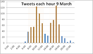
To get an idea of what happens during an event, in the following charts we have also plotted the number of tweets per hour containing the text c4athletics.  The columns in brown are for times when the channel was broadcasting the athletics, those in blue for other times.  


These charts give a picture of how viewers used Twitter for this one event.  No doubt other events would give a different pattern, but there are several point of interest.  As we might expect, most activity was during the transmission.  There were also significant numbers of postings at other times especially in the lead up to transmission.  On the 10 March in the morning the athletics was broadcast from 7 am to 10.30 am, but from 8-9 it was interrupted by a programme on another sport, regularly broad cast in that slot.  To maintain the other sport in its regular slot may well have ensured the satisfaction of its viewers, but, judged by the numbers of tweets, it lowered interest in the athletics, an effect that continued throughout the day.    

What conclusions can we draw from these numbers?

Although the numbers of tweets using the programme's hashtag was comparatively  small, their influence was potentially much wider, as that hashtag will have been propagated to the followers of those tweeting.  More details on this in a later post.

It is arguable that those numbers would have been larger if the hashtag had been actively promoted before the programme in all pre-programme publicity such as trails.  The downside of doing that might have been to discourage those who do not tweet from watching the programmes.

The pattern of tweets, such as that for 10 March above, gives information about viewer response to programme scheduling.


An analysis of the tweet contents will be produced later since they contain much of interest such as  reactions to individual presenters and the programme content.  Automatic analysis doesn't necessarily give a good picture.  In practice such analysis would best be done in conjunction with the analysis of audience data since those tweeting are only a small (perhaps atypical) part of the audience.


Thursday 8 March 2012

Can you tell males from females


In analysing usage of social media sites such as Twitter one of the categories often used is male/female.  On this scale there are some sites with a preponderance of males (Slashdot, Google+ and Reddit), others where they are roughly equal (Facebook and Twitter) and maybe some where females are in the majority (possibly MySpace and Bebo).

This raises the question, how do you count the numbers of males and females on a social media site?  Take Twitter as an example.  There is nothing about gender on a user's profile and so the analyst can only deduce the gender from the name or information in the profile.  It's often said (e.g. http://www.sysomos.com/insidetwitter/mostactiveusers/#males-vs-female) that a user's gender can be found by looking up the first name in lists and databases.   I decided to try this approach by getting the genders of the users I'm currently following (my followees) on Twitter.  Hardly a representative or large sample but a simple starting point.

The results changed my thinking:

Genders of my followees on Twitter


In my case there were considerably more more males than females, but the surprise was the number of users who were neither. In some cases it wasn't possible to identify gender even with the help of those lists of names.  Of course some names such as Lesley are inherently ambiguous.  Others are not on the lists, being unusual or nicknames.  I could identify gender for some users from their profile photos but have not included these in the male/female numbers as I was trying to replicate what an automated system based upon text analysis might do.

However these exceptions were only a small proportion of the Other category (some 10%).   The rest of the Other users were organisations.  One's first impression of Twitter is that it is for people to communicate their interests to other people and this may well have been what happened in its early days.  But the results here, which I believe are not atypical, show that the situation has changed as commercial and other organisations establish a presence.  A lot of questions follow from this.  What kinds of organisations have a Twitter presence?  What use do they make of it?  What interest do they attract? Does their activity vary over time?   From that perspective the ratio of males to females seems of minor importance.  It's more a question of people versus organisations now.


Monday 6 December 2010

Twitter and Power Laws

The web seems to be one of many areas of human activity where power laws hold sway. The book by Barabasi gives a very comprehensible account, neatly sidestepping the mathematics.

The web is a network, in fact several different kinds of networks and the number of links that come from each network node can often be expressed by a power law.  For example we may be interested to know how the number of incoming links on a web page (the node) varies from page to page.  We might expect that most web pages had roughly the same number, not too far from some average, just as most people's height is around the average for the population.  But as Barabasi recounts that is not the case for links to web pages.  Most web pages have a few incoming links, whilst a few pages have a very large number.  If you plot the graph it might look like this: 


The mathematical expression of a power law is in fact rather simple as such things go.  It is something like
                         number of web pages = constant * number of links power

The value of power is typically in the range -2 to -3

This idea has been applied by Milovanovic to four quite different sets of data.  They all show, with varying degrees of conviction, a power law distribution.

The one which interests us here is a plot of the number of followers of 11.5 million Twitter users. This shows a very clear power law distribution with a power value of -2.25.  The power law in this case refers to the whole linked network of these millions of users.   That certainly helps us to understand the structure of the whole network. However we may be interested in the nature of the network as experienced by an individual user such as the distribution of their followers.  To do this we can plot the number of followers of each of the followers of this individual user - does this also give a power law?  Having done this for a few users the answer seems to be that typically as the number of followers becomes large, of the order of 10's of thousands, a power law distribution is approached.

But most users do not have 10's of thousands of followers.  What is the distribution of their followers?  They can be characterised in part by simple measures such as the proportions of their followers that fit into defined categories, such as the tail of the distribution, set perhaps arbitrarily at 100000 followers.

In networks such as that of Twitter users there would seem to be considerable possibilities to explore deviations from power law patterns.

Barabasi, A (2002), Linked, Penguin Books Ltd, London 

Milovanovic, G.S.(2010) Online Contributions to the Global Community: The Power Laws for New Media Available from:

Friday 8 October 2010

FriendorFollow - Excellent in parts


I'm looking at some Twitter apps to try to analyse what type of networks people in education develop using Twitter.

One I'm trying out is FriendorFollow. You put in any Twitter username (no passwords needed and a nice simple interface) and it provides 3 pieces of information for that username:
  • A list of users you follow who don't follow you back
  • A list of your fans - those who follow you that you don't follow back
  • A list of friends - those who you follow and who follow you back
The results give thumbnails for each user; mouse  over on a thumbnail gives that user's profile. The number in each list is also given.

It's a useful and effective app.  The response is usually reasonably quick but can be much slower for people with large numbers of followers and friends.  Some people find it useful for managing their followers.

So far so good.  But there are some problems.  For each  list mentioned above a CSV file with a line for each user may be downloaded.  Potentially a very useful facility.  But for each user only two numbers are given:
  • Followers_count - this is (reasonably) the sum of fans and friends, and is meant to be the same as the followers number in Twitter
  • Friends_count - this is the sum of those you follow but don't follow you back plus friends, and is meant to be the number that Twitter calls "Following", i.e. simply the number you follow
So there is some confusion about terminology but the above explanation clarifies this (I hope).

More importantly against these numbers is a "status date" which I take to be the date when the numbers were obtained from Twitter.  This date is NOT the date when the numbers for your input username are obtained.  The numbers have been obtained some time in the past; they can be up to two years out of date.  So for most purposes they are quite useless. 


A couple of other small things about this app.  Putting in a non-existent user gives a system  error message; it doesn't say the username doesn't exist.  Also, surprisingly, the Twitter account for FriendorFollow seems dormant at present.


Overall a very useful app but be careful about some of the detail in the numbers

Wednesday 29 September 2010

How bad is your online experience?

As new technologies come along every day, we sometimes forget just how bad is the experience we still get from many an established web site.

Take my frustrations last Saturday when I wanted to make an online donation to a charity. I started from the home page of the company I use to make charity contributions, wanting to specify a charity and then log in to my account.

So I searched for the charity - a well known one, the Disasters Emergency Committee. It wasn't found, nor were any abbreviations for it. Today in talking to the charity company I found there is indeed an error in their search subsystem. But in small blue type on the home page were the words "Pakistan Flood Appeal". So I should have found those words by reading the home page? Not on your life. It's well established that people don't read web pages so much as scan them - see the interesting eye tracking pictures in this article by Jakob Nielsen:

http://www.useit.com/alertbox/banner-blindness.html

So twelve years after the idea of banner blindness was first raised it seems that many web designers aren't aware of it.

Then  I tried to log in to my account. I got a "web server error" message. Obviously the server for the user accounts was down. It was back up again on Monday. I was told that the server is always available at the weekend. Yeh - right. Perhaps they hadn't thought about (or couldn't afford) hardware to ensure uninterrupted running.

My third Saturday morning problem was a curious one. I went directly to the charity and tried to make my donation by phone - an automated system. All went well until I was asked to give the 3 digit security code on the back of my card. I was making my donation from my charity account, for which they had issued a special card. I turned over the card. No security code! On Monday I checked with the charity company. Yes there had been a problem. When the charity had updated their automated donation system they had forgotten that the card for my charity company did not have a security code on the back. So talks were now underway to resolve the situation.

The lesson from these experiences?  There are still many organisations that don't have useable websites.